Using variable fonts for posters is a smart way to make your designs stand out. These fonts are flexible, easy to adjust, and look great on any type of poster. They help you keep a clean style while saving time and space in your design process.

What Are Variable Fonts
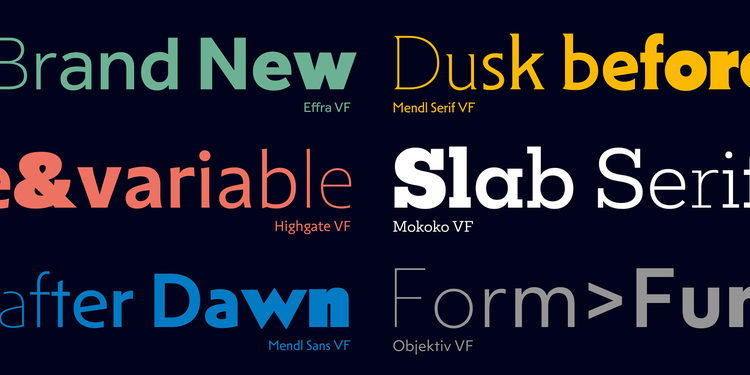
A variable font is a single font file that contains many styles inside it. Instead of downloading separate bold, light, or italic files, you can change everything from thickness to width in one font.
This makes variable fonts perfect for posters because you can easily adjust the look without changing the font family. You get more freedom with fewer files.
Why Variable Fonts Are Good for Posters
Posters need fonts that are bold and flexible. You often need different text sizes & styles in one design. These fonts for posters let you do that easily.
You can make the title bold and heavy, and keep smaller text light and thin — all using the same font file. This keeps your design consistent and smooth.
Variable fonts also make you edit the design faster. You don’t need to switch between multiple fonts.
Popular Variable Fonts for Posters
There are many fonts that work beautifully for posters. Some popular ones include:
TT Norms Pro Variable – made by TypeType, clean and modern, perfect for business or tech posters.
Roboto Flex – smooth and easy to read, great for digital and print posters.
Inter Variable – simple and clear, fits minimalist designs.
Poppins Variable – round and friendly, perfect for creative posters.
These fonts give you the freedom to adjust your design however you like without losing quality.
TypeType and Variable Fonts
The TypeType foundry is known for making high-quality variable fonts that designer are trusting these days. Their fonts are used by many brands and digital agencies around the world.
For example, TT Norms Pro Variable gives you full control over weight, width, and style. You can make smooth changes between thin and bold without using different font files.
TypeType’s variable fonts are also tested for perfect spacing and readability. This means your poster will look clear and balanced at any size.
How to Use Variable Fonts in Posters
When using variable fonts for posters, start by setting your main title first. Make it bold enough to catch attention. Then, use lighter styles for the subtext or tagline.
Keep your design simple. Use space wisely so the text doesn’t feel crowded. Posters should be readable from far away, so avoid too much decoration or tiny letters.
They let you fine-tune your design — you can make small adjustments to weight and width until everything feels right.
Advantages of Variable Fonts
thesefonts have many benefits for poster design:
They reduce file size because one file contains many styles.
They help maintain design consistency.
They allow smooth transitions between styles.
They make text adaptable for both print and digital posters.
You can also make subtle design tweaks to match your brand or theme without downloading extra fonts.
Common Mistakes When Using Variable Fonts
Some people try to use too many variations in one design. This makes the poster look messy. Stick to one or two main looks — for example, one bold and one light version.Another mistake is stretching or squeezing fonts too much. Even though variable fonts allow adjustments, overdoing it can ruin the balance.Always check how your poster looks from a distance. If the words are still easy to read, you’re using the font correctly.
Tips for Better Poster Design with Variable Fonts
Use contrast — pair a heavy title with light details.
Keep your text centered and well-spaced.
Test your colors — dark text works better on light backgrounds.
Avoid mixing too many different fonts.
Using just one variable font family, like TT Norms Pro Variable from TypeType, keeps your poster clean and professional.
Why Designers Love Variable Fonts
Designers love variable fonts because they make work faster and simpler. You can design everything — from a small logo to a big poster — using one font family.They also save space, which helps when exporting or printing your design. Most design apps and video tools like CapCut, Photoshop, and Figma now support these fonts easily.
Brands trust TypeType and similar foundries because they are high-quality, reliable, and well-tested.
Final Thoughts on Variable Fonts for Posters
Using variable fonts for posters gives you control, style, and speed. You can design strong and flexible posters without juggling multiple font files.A foundry like TypeType makes it even easier with clean, modern, and readable fonts. With the right variable font, your poster looks professional, balanced, and ready to grab attention anywhere.


